Brief
Color Grid
You will create one color grid following these instructions:
- Create one color chart building off of Itten’s contrast of value grid.
- This grid will consist of 156 squares (13 × 13 grid), each square measuring 0.5 inches in height and width (the entire grid will be 6.5 × 6.5 inches).
- Draw the grid with your ruler and pencil first.
- The bottom row of the grid is black, and the top row is white.
- The far left column is gray and the far right column is violet.
- You would fill in the rest of the squares appropriately to create regular gradations. See figure 1 below.
Linguistic Color Grid
Your second color grid follows these instructions:
- Create a second “color” grid using only language.
- This will consist of 25 squares (5 × 5 grid), each square measuring approximately 1 inch in height and width (the entire grid will be approximately 5 inches square).
- The bottom row of the grid should be variations on black names, and the top row variations on white names.
- The far left column names should deal with reds/magentas, the next column oranges, the next column, yellows, the next column greens, and the last column blues/cyans. You can use the Imaginary Color Name Generator to come up with fun names, or you can do so on your own.
- You will fill in the rest of the squares appropriately to create a gradation and amalgam of names. See figure 2 below. Mix the colors linguistically—blending neighboring squares’ language—or conceptually—blending the general concepts.
- You may write and draw this grid by hand, or digitally.
Color Compositions
Your remaining two works should each be be no smaller than 10 inches at their smallest dimension. You will base these compositions on two of your composition thumbnails and they will each explore one of the principles from these color contrasts:
- Contrast of Hue
- Cool-Warm Contrast
- Complementary Contrast
- Simultaneous Contrast
- Contrast of Saturation
These two new works will be in color, taking their color from your first newly made color grid (above). All color should be pre-mixed on the palette before applying it to the paper—i.e., no wet-on-wet mixing on the paper. All colors should be flat (no smooth gradients) and cleanly butt up against adjacent colors. You may augment the original thumbnails and add new details since those were meant to be quick sketches that set out the major areas of light and dark.
Materials
- 3 sheets of 11 × 14 in. paper (mixed media pad)
- Ruler
- Pencil
- Micron pen (if you opt to write/draw the linguistic color grid by hand)
- Acrylic paints
- Painter’s knife
- Brushes
- Disposable palette
- Cups or jars for water
- Rags or paper towels for clean up
- Soap or shampoo for cleaning brushes
- Optional:
- Blue tape to stretch the paper or make clean lines in the painting
Examples
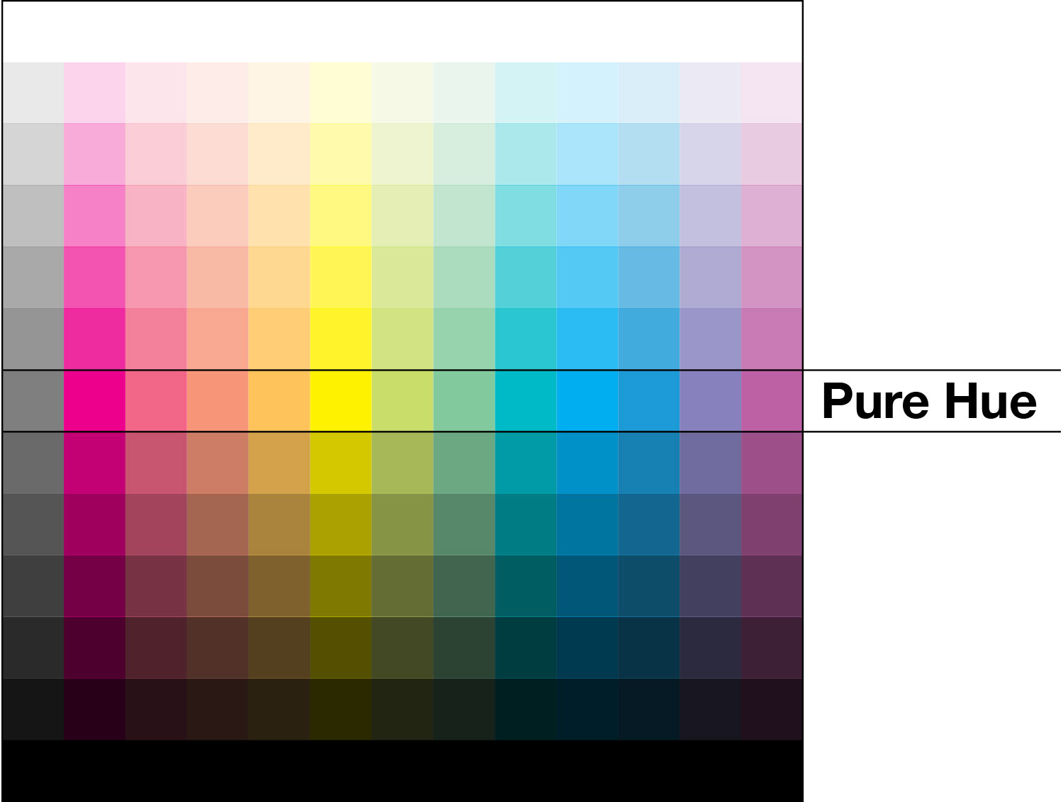
Figure 1: Contrast of Value Grid

Figure 2: Linguistic color chart
Deliverable
Upload your images to the Google Slides template (see link at top of the page) for this assignment under your name.
Grading
Assignment grades will be based on the following:
- Aesthetic Principles (40%)
-
Student demonstrates evidence that they understand and inventively integrate aesthetic principles.
- Excellent: Student employs the aesthetic principles addressed in class to create work that is individual and engaging.
- Average: Student is able to rotely employ the principles addressed in class to create a standard project, but not make it their own.
- Below Average: Student struggles to demonstrate a grasp of the principles and shows no facility in internalizing the ideas.
- Labor and Technique (40%)
-
Student works fastidiously to apply appropriate techniques to the project and shows a growing facility with those techniques. The student’s labor is evident and ample given the allotted time.
- Excellent: Student understands demonstrated techniques and nimbly employs them in their work.
- Average: Student makes some stylistic and technical mistakes by ignoring provided guidance.
- Below Average: Student repeatedly makes the same mistakes and ignores instructor input and suggestions.
- Following Instructions (10%)
-
The student adheres to the guidelines provided for the course and the assignment. If the project has a particular framework, the student adheres to that framework. If an assignment is to be submitted on a Google Slide, the student does not email the instructor a JPG.
- Excellent: A detail-oriented student who takes instruction and fastidiously executes it within their work.
- Average: A student who misses some details because they didn’t read instructions thoroughly or take proper notes when instructions were given.
- Below Average: Student ignores basic instructions and guidance given for assignments.
- Reflection (10%)
-
Student notes on critiques along with personal reflection on their projects show a growing sense of awareness of how their work can be received and understood.
- Excellent: Student diligently takes notes during critiques, noting the core concerns of the critics, and expresses their own views thoughtful and honest self assessment.
- Average: Student’s critique notes address only surface concerns and/or their own self reflection writing is hurried and vague.
- Below Average: Student does not take good notes and their self assessment is incomplete or dishonest.
- On-time Submission
-
Work that is not present for a synchronous critique, or is too late for an asynchronous critique will lose points under the Reflection category for not having notes from the critique.
Why?
To familiarize you with working in color, this assignment is training your eye and your mind to work through how different colors are mixed, and how they impact one another when juxtaposed in compositions. This is also an exercise in precision where the colors butt up against each other in clean, graphic lines. In addition, this is a way to explore how language impacts our perception of color.
Learning Outcomes Addressed
- Spatial Skills
-
Students will be able to generate, organize and communicate ideas in two-dimensional space using basic principles of color and composition.
- Technical Skills
-
Students will be able to employ various digital and analog techniques to realize and evaluate aesthetic compositions.
- Aesthetic Sensibilities
-
Students will be able to create two-dimensional compositions of varying sensibilities and articulate their appreciation of others’ art.